Intro
{whitewater} was originally developed for parallel processing but has always had some data wrangling and transformations sugar that can help visualize USGS NWIS data effectively. In this post we’ll use the advantages of {whitewater} to look at a site graphically a few different ways (tiled, hysteresis, 3D spaghetti).
Get Data
Let’s load the packages. We’ll use {ggfx} to give it an extra effects but you don’t necessarily need it.
library(whitewater)
library(dplyr)
library(ggplot2)
library(ggfx)
library(patchwork)
library(plotly)
Now let’s get a sites daily value. We’ll get a couple different flow regimes (snowmelt vs precipitation/snowmelt (mix)).
Raster Graph
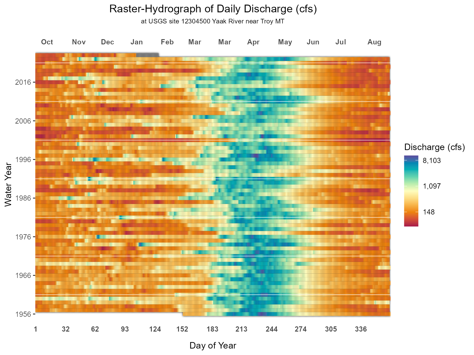
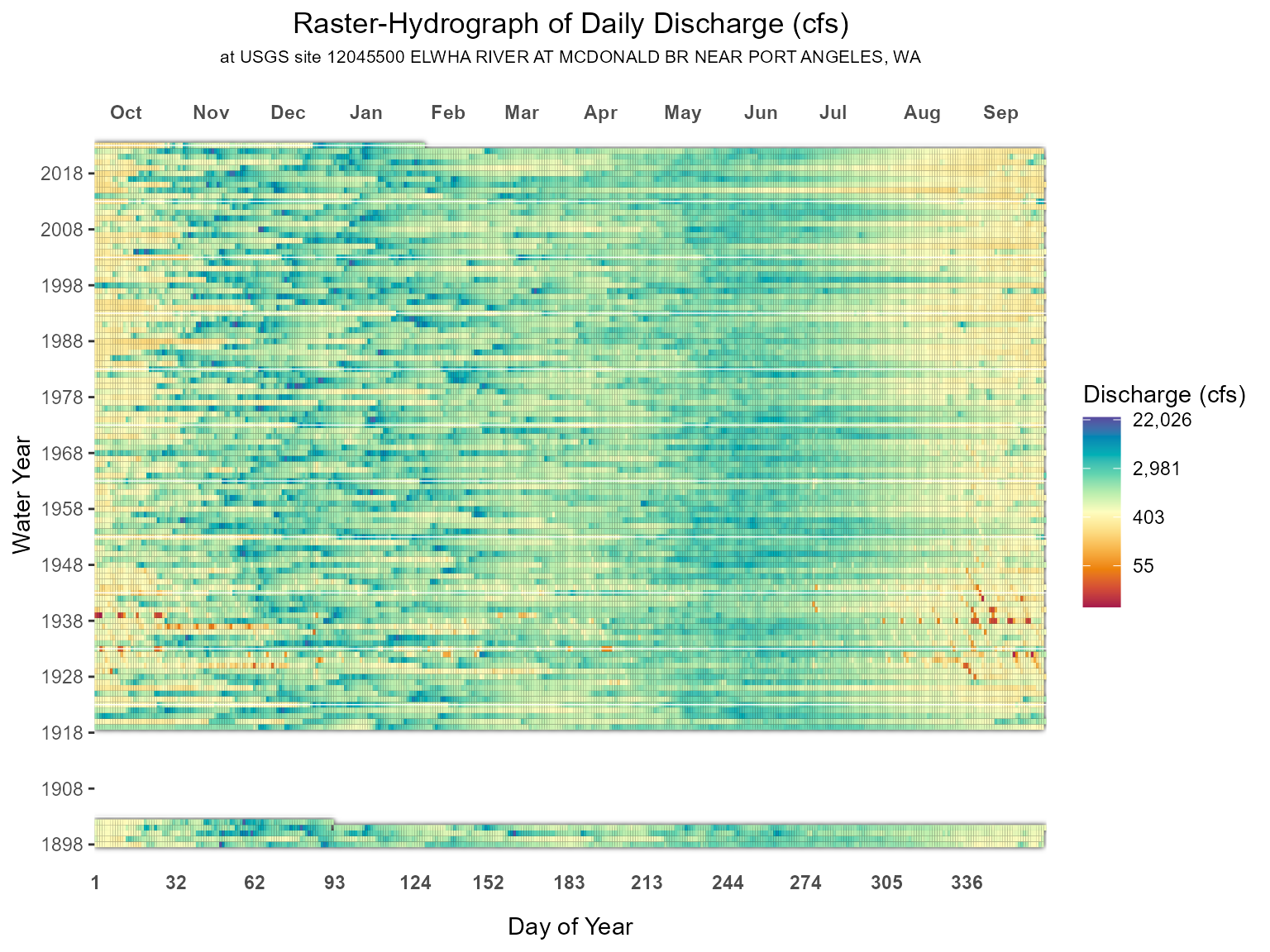
This is an approach I saw during a presentation Koehler (2004) and can be accessed as well through the Raster-Hydrograph builder online.
Below is the code to create raster-hydrograph plot using {ggplot2}. What’s nice is the wy_doy and month_abb that whitewater returns. This let’s us stack the water years and the day of the year like a raster or tile. This is essentially a heatmap by water and day of year filled by flow value.
#raster-hydrograph function

raster_hydrograph <- function(daily_values) {

xbreaks <- c(1, 32,  62,  93, 124, 152, 183, 213, 244, 274, 305, 336)

dup_labels <- function(x) daily_values$month_abb[match(x, daily_values$wy_doy)]

daily_values %>%
  ggplot(aes(wy_doy, wy)) +
  with_outer_glow(geom_tile(aes(fill = Flow))) +
  scale_y_continuous( breaks = seq(min(daily_values$wy),
                                  max(daily_values$wy),
                                  by = 10),
                     name = 'Water Year') +
  scale_x_continuous(breaks = xbreaks,
                     name = 'Day of Year',
                     sec.axis = dup_axis(labels = dup_labels, name = NULL),
                     expand = c(0,0)) +
  scale_fill_gradientn(colors = hcl.colors(11, palette = 'Spectral'),
                       labels = scales::comma,
                       name = 'Discharge (cfs)',
                       trans = 'log') +
  labs(title = 'Raster-Hydrograph of Daily Discharge (cfs)',
       subtitle = paste0('at USGS site ', daily_values[1,]$site_no,
                         ' ',
                         daily_values[1,]$Station)) +
  theme(plot.title = element_text(hjust = 0.5),
        plot.subtitle = element_text(hjust = 0.5, size = 8),
        panel.grid.minor.x = element_blank(),
        panel.grid.major.y = element_blank(),
        panel.grid.major.x = element_blank(),
        panel.background = element_rect(fill = NA),
        panel.ontop = T,
        axis.ticks.x = element_blank(),
        axis.text.x.bottom = element_text(vjust = 5.5,face = 'bold'),
        axis.text.x.top = element_text(hjust = -.45, vjust = -5.5, face = 'bold'))
}
Now we can plot any station from the ww_dvUSGS() functions. Notice how different the two graphs are! This is a reflection of the different flow regimes and how distribution and timing of runoff matters.
raster_hydrograph(yaak_dv)
raster_hydrograph(elwah_dv)
Hysteresis
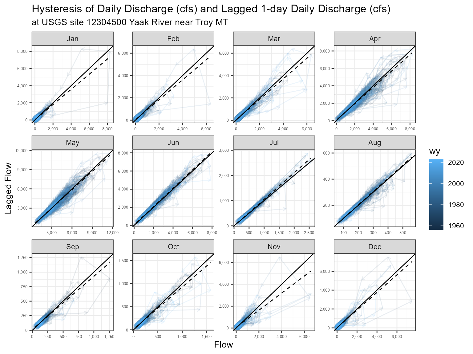
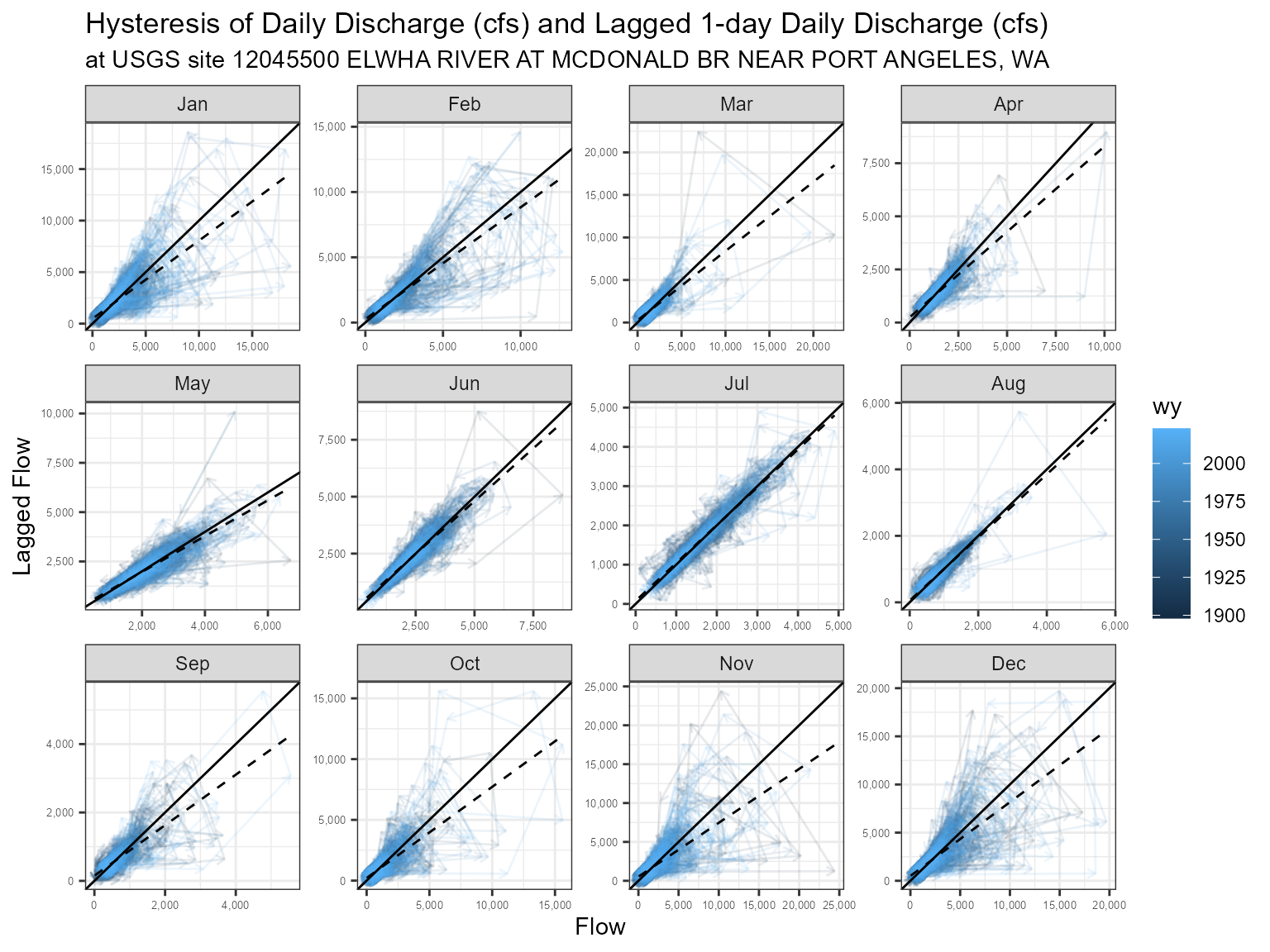
Another way to view these flow regime differences is through a lagged version of itself. In other words, a bivariate plot of flow and its lagged flow (we’ll just use 1 day lags). In a basic sense the flow will make clockwise circles. The width of these circles can help understand the response of the system, i.e. wider meaning flashier and narrow meaning slow steady increases.
To do this we’ll need to create some lagged versions of the daily value tables.
lagged_yaak <- yaak_dv %>% mutate(flow_lag = lag(Flow, 1))
lagged_elwah <- elwah_dv %>% mutate(flow_lag = lag(Flow, 1))
Now let’s create a function like we did before to look at all the months. We’ll also add geom_abline() and compare it to the relationship between flow and lagged flow. This will hopefully show some differences between the two sites, e.g. separation from abline meaning quick/flashy runoff.
hysteresis_plot <- function(daily_values, lag_days = 1){

lagged_df <- daily_values %>% mutate(flow_lag = lag(Flow, lag_days))

lagged_df <- lagged_df %>% filter(!is.na(flow_lag))

lagged_df_final <- lagged_df %>% group_by(month_abb) %>%
             tidyr::nest() %>%
             mutate(model = purrr::map(data, ~lm(.$flow_lag~.$Flow, data = .)),
                    pred = purrr::map2(data, model, ~as.numeric(predict(.y, .x)))) %>%
             select(data, pred) %>%
             tidyr::unnest(c('data','pred'))

  lagged_df_final %>%
  ggplot(aes(Flow, flow_lag)) +
  geom_path(aes(color = wy),
            alpha = 0.1,
            arrow = ggplot2::arrow(
              length = ggplot2::unit(1.5, "mm"),
              ends = "last"
            )) +
  geom_abline(slope = 1, intercept = 0) +
  stat_smooth(geom = 'line',
              method = 'lm',
              linetype = 2, aes(Flow, pred)) +
  scale_x_continuous(labels = scales::comma) +
  scale_y_continuous(labels = scales::comma) +
  labs(y = 'Lagged Flow',title = 'Hysteresis of Daily Discharge (cfs) and Lagged 1-day Daily Discharge (cfs)',
       subtitle = paste0('at USGS site ', daily_values[1,]$site_no,
                         ' ',
                         daily_values[1,]$Station)) +
  facet_wrap(~month_abb, scales = 'free') +
  theme_bw() +
  theme(axis.text = element_text(size = 5))

}
hysteresis_plot(yaak_dv)
hysteresis_plot(elwah_dv)
3D Spaghetti
Sometimes it’s nice to visualize a hydrograph by a line across time but this can get distracting when you have a lot of years! So a compromise can be either faceting or try and make it 3D. Below we’ll use the {plotly} package to visualize hydrographs 3D. Again, we can see the difference in flow regimes and how sometimes the snowmelt regime can get rain-on-snow at the end of the fall.
plot_ly(yaak_dv, x = ~wy_doy, y = ~wy, z = ~Flow, type = 'scatter3d', mode = 'lines',
line = list(width = 2.5), color = ~wy, colors = 'RdBu')As you can see it’s fun to play around and see how the water is expressed over time!